Friday 28 September 2012

ETF Screeners Compared

The rapid expansion of ETF offerings in recent years (over 300 now traded in Canada!) has brought a new challenge - how to sort and sift through them all to pick the best ones for a portfolio. Enter the ETF screener, a tool for just that purpose. Let's have a look at seven screeners that include Canadian ETFs i.e. we will put aside screeners that only cover US-traded ETFs (such as those linked to in the right column of this blog under ETF Directories). We'll also just deal with free screeners, ignoring the gold or premium versions that some websites offer. We include in our survey a couple of discount broker screeners from BMO Investorline and TD Waterhouse (unfortunately this blogger doesn't have accounts with every broker out there so it has been impossible to cover all the broker offerings) as they do come free with a broker account.

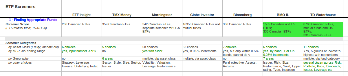
Step 1 - Finding the Appropriate ETFs (and Possibly Mutual Funds)
The search for investments to buy for a portfolio begins with a hole to fill. Usually, that is based on an intended asset allocation (see our long ago posts on Asset Allocation and others in June and July 2008 on the planning process that precedes a purchase decision). In this test, we chose as an example to look for Canadian Equity ETFs in order to do some nitty gritty assessment.

The Screeners
Our seven screeners are:


The table below shows how they stack up in the process of narrowing down the search. Green text shows where a screener provides capabilities that we think are helpful, while green highlighted cells show where something we think is really important is done really well.
BMO Investorline and TD Waterhouse are the two best screeners for the "finding" task for several reasons. First, they cover both Canadian-listed and US-listed ETFs in a combined search. That is an advantage especially when looking for foreign equity (such as in our recent look at European equity), foreign income, foreign commodity or other specialty ETFs. Canadian-traded ETFs with foreign equities are much less numerous and most are hedged, a feature not all investors want. TD Waterhouse and Globe Investor even include mutual funds in a single search, though TD's is better as there is an optional tick box to include them. Second, BMO and TD allow very quick, progressive narrowing of the candidates from a handful of choices to get to a manageable number to compare. Third, for the more exacting investor, they have a lot more selection factors for narrowing the search.

Step 2 - Analyzing the Options
The same overall result comes out of the next step of comparing the alternatives - BMO and TD are appreciably ahead of the pack. See all the green under their columns in the table below.

We found their side-by-side comparison feature, which none of the other screeners have, to be a powerful time-saver. The ability to scan down a list of key characteristics such as Management Expense Ratio (MER), returns, volatility, composition of holdings and tracking error, instead of laboriously opening detail sheets for each ETF in turn, is a massive convenience. In addition, on most of the other factors, BMO and TD does as well as, or better than, their rivals. An exception, curiously, is that they both are missing the crucial MER for one of the mainstream Canadian equity ETFs, the PowerShares FTSE RAFI Canadian Fundamental Index (TSX symbol: PXC). ETF Insight, Morningstar and Globe Investor all have the MER. TMX Money is worse though - it shows the MER for the wrong fund.

There are other errors in the data we found - some MERs and returns. The moral of the story is that nothing is perfect, there are errors in data. For important numbers, it is a good idea to check several sources.

Ease of Use
Some of the screeners ended up being pleasant to use, while others became frustrating. Our table below shows what we found.

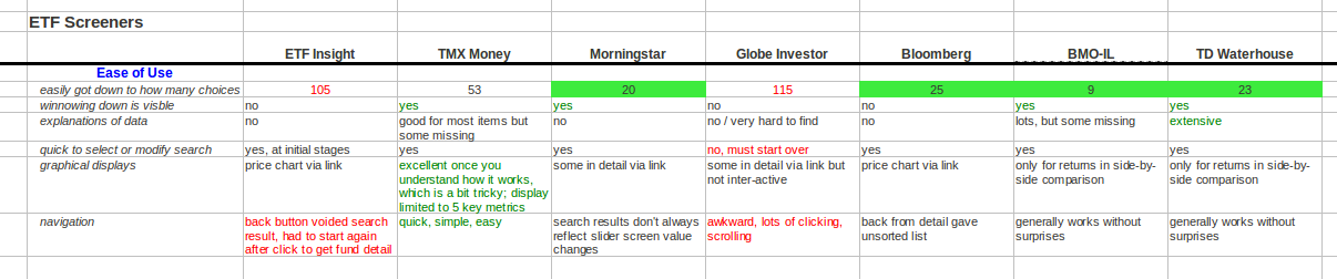
The ability to quickly get down to a manageable number of ETFs when doing our Canadian equity search became more significant as we passed from one screener to another knowing exactly what we wanted and what should come out. Again, the green highlight cells show the best screeners. They quickly spit out about twenty ETFs, which fit on one screen and avoids clicking through multiple pages. Ending up with over 100 ETFs in a list is no help and it is annoying to spend a half hour exploring the ways to get the number down. On ease of use overall, Morningstar, Bloomberg, BMO and TD do a good job. If only TMX could more easily narrow the list of ETFs, its superior graphical and condensed, simple displays of results would make it outstanding.

Bottom Line
The free screeners provided as part of the standard discount broker account package capabilities from BMO Investorline and TD Waterhouse are fine tools and generally stronger than competing websites. Nevertheless they are not perfect in every way (is anything?) and the investor may benefit from cross-checking data with the other sites, or for obtaining unique data such as TMX's. For US ETFs, when preliminary screening involves US ETFs, some of the US-only websites may provide additional unique data.

Disclaimer: this post is my opinion only and should not be construed as investment advice. Readers should be aware that the above comparisons are not an investment recommendation. They rest on other sources, whose accuracy is not guaranteed and the article may not interpret such results correctly. Do your homework before making any decisions and consider consulting a professional advisor.

Friday 21 September 2012

Dividend Income from High Quality Preferreds: Split Shares, Companies and ETFs Compared

Preferred shares have several attractive features for the investor seeking income:
  • Tax-advantaged dividend income, which can be worth up to 20% more after tax, depending on province and income level (see the Ernst & Young 2012 Personal Tax Calculator) e.g. 3% of dividend income produces as much net of tax as 3.6% of interest in a taxable account.
  • Constant, reliable, regular income flow, like interest (with a caveat when it comes to ETFs, as discuss below)
  • Greater certainty of payment than dividends on common shares since preferreds almost always take payment precedence over common shares
A few years ago, we explored split share preferred shares, outlining other important risk and reward features. We also found some attractive yields amongst them. Today we'll have another look and compare the other options - individual company preferred share issues and ETFs holding a basket of company preferreds. We'll restrict ourselves to safer investment grade shares i.e. those rated as Pfd-2 or Pfd-1 by the credit rating agency DBRS.

The Investment Grade Split Share Preferreds
These come in two varieties - securities of a single company, or one that holds multiple companies. From our detailed comparison table below, we find some good and some not-so-good-looking investment possibilities.


Beware the return illusion of current yield
Most of the data is just straight drudge work copying from the provider websites but one key element, the yield to maturity, which is how much the investment promises to deliver if held to maturity, was calculated from Shakespeare's free downloadable spreadsheet. Most importantly, the spreadsheet properly takes into account, as well as the regular dividend payment, any change in principal value between purchase and eventual maturity or redemption of the preferred share. This factor often destroys what looks to be a good return at first glance, seen in the table as the current yield (highlighted in our caution orange colour), which is simply the dividend payment as a percentage of purchase price.

Since the market price in almost every case exceeds the eventual maturity price the investor will get back, the current yield is very deceiving. It is higher in almost every case than the yield to maturity. The only exceptions are BAM Split Corp. 4.35% Class AA Series III (BNA.PR.C) and BAM Split Corp. 4.35% Class AA Series V (BNA.PR.E), where the shares trade at a discount so there will be a capital gain.

Beware the danger of early redemption
The worst situation is First Asset CanBanc Split Corp. (CBU.PR.A). The current yield looks nice at 5.00% but the real return the investor will get paying the $13.00 market price to receive only $10.00 at maturity on 15 January 2016 is a negative 1.8%. In fact, the outcome will likely be even worse. Since the fine print of the corporation's rules allow capital shareholders to submit shares for reimbursement at Net Asset Value once a year in January, and since the market price of the capital shares is now 20% (or $6.50) less than NAV, it is quite likely speculators will see a pretty good bet and submit capital shares for retraction this coming January, which will cause the company to pay back an equal number of preferred shares. Buying for $13 now and getting $10 back in January from the corporation is not the way to make money!

A number of other shares are exposed to this danger, as highlighted in red in the column titled Yield to Possible Early Redemption. The more the capital share is trading at a discount to Net Asset Value (NAV) and the greater the premium of the preferred over its redemption price, the greater the danger. In addition to CBU.PR.A, Utility Split Trust (UST.PR.B) looks quite bad in this regard.

A couple of attractive preferreds
Both our two discount preferreds - BNA.PR.C and BNA.PR.E look quite good as investments. Both offer very solid yield at around 5% and it is highly unlikely either will be redeemed early. The conditions for these issues state that if the corporation decides to redeem early it will have to pay $26.00 now for each share of the preferreds, sliding downwards year by year to the eventual maturity redemption price of $25.00 (see details at PrefInfo). Unless something really goes wrong at Brookfield Asset Management the company that underpins the whole corporation (and DBRS thinks there is plenty of protection and sfaety with its Pfd-2Low rating), the preferred shareholders should receive their steady returns till 2019 and 2017 respectively.

The Alternatives - Company Preferreds and Preferred Share ETFs
The bottom of our table shows a sample of the many company-issued preferred shares. The Brookfield Asset Mgmt Inc Cl A Pr Ser 12 (BAM.PR.J) comes directly from the same company on which BNA.PR.C and .E are based. BAM.PR.J's yield to maturity is almost 1% lower, which is quite a lot. Either investors see extra risk in the split share structure and thus demand a higher yield from the BNA shares, despite what DBRS thinks in rating the two securities with the same Pfd-2Low, or the current yield illusion is at work.

On the other hand, two other company preferreds from Great West Life and Power Financial, both rated more secure by DBRS at Pfd-1Low, have yields a bit lower than the BNAs'.

The three ETFs holding baskets of Canadian preferred shares have yields close to the our best split share picks and generally appreciably higher than those of the other splits. Adding in the ETFs' better diversification from much broader holdings, should ETFs be the best choice for the average investor? A couple of extra factors might affect that conclusion. First, two of the ETFs, iShares S&P/TSX Canadian Preferred Share Index ETF (CPD) and Horizons Preferred Share ETF (HPR) contain a fair chunk (18-25%) of lower grade Pfd-3 preferreds (though none at the junk end of the spectrum). That boosts dividends but increases risk. Second, though the yield to maturity is as shown, the ETFs never mature and the investor will have to sell at some point to get back the capital. As interest rates and economic conditions vary the price of the ETF will too, unlike the fixed maturity / redemption value of all split, and some company, preferreds. The yield to maturity will vary with changes in duration of the fund as holdings get bought and sold or mature. Third, the yield to maturity will be about 0.50% less than that shown in our table due to the ETFs' MER. Finally, the cash distributions of the ETFs vary too, as can be seen by checking the ETF provider Distributions pages for Horizons, Powershares, and iShares.

Disclosure: This blog writer owns GWO.PR.H and BNA.PR.C shares.

Disclaimer: this post is my opinion only and should not be construed as investment advice. Readers should be aware that the above comparisons are not an investment recommendation. They rest on other sources, whose accuracy is not guaranteed and the article may not interpret such results correctly. Do your homework before making any decisions and consider consulting a professional advisor.

Friday 14 September 2012

Europe - Is Now a Good Time to Invest?

"Investors should remember that excitement and expenses are their enemies. And if they insist on trying to time their participation in equities, they should try to be fearful when others are greedy and greedy when others are fearful" - famous investor Warren Buffett, quoted on Wikiquote

Fear seems to have reigned in Europe ever since the credit crisis and market crash of 2008. Every year and month a new crisis seems to have arisen - governments about to default on debt, or seemingly headed that way; banks in need of recapitalization; property values in the dumpster; potential eurozone breakup; ongoing economic recession and high unemployment.

It's no surprise that European stocks have been hammered and are still way down from the pre-crisis 2008 peak. An easy way to see this is through broad multi-country European equity ETFs. ETFdb's Head-to-head comparison tool tells us that the 5-year performance of the biggest broad-based (455 holdings in 16 countries) European ETF Vanguard's MSCI Europe ETF (NYSE: VGK) is a painful minus 19.3% while the USA's benchmark ETF, the SPDR S&P 500 (NYSE: SPY), is a positive 7.97%.

Enticing Fundamental Indicators - Price/Earnings, Price/Book, Dividends
Will things start to get better in Europe? If that is so, the numbers in our comparison table below look quite attractive in terms of three common measures of stock valuation. P/E and P/B are both appreciably lower, and dividend yield appreciably higher, than for the benchmark ETFs in both the USA  and Canada (iShares S&P/TSX 60 Index ETF symbol TSX: XIU)


The dividend yields in particular offer promise beyond the mere fact that more money is being dished out to the investor. As we have written about before in Are Stocks Risky in the Long Run? and in What Long Term Return Can We Expect from the TSX? high dividend yields have often foretold higher returns. The following chart from ETFreplay.com shows that dividend yields in Europe, as shown by the iShares S&P Europe 350 Index Fund (NYSE: IEV; blue line in the chart image), are higher now than they have been through the past decade, except for the huge spike at the height of the financial crisis. In contrast, the USA's SPY (the yellow line) is trundling along quite close to its pace of ten years ago.
IEV's distributions did fall sharply after 2008 but they have steadied and even recovered some since. VGK shows a similar pattern when the IEV vs VGK comparison is made in ETFReplay.

Not much banks or PIGS countries in European ETFs
A reassuring fact is that the holdings of the big European equity ETFs are not heavily concentrated in either financial services or in troubled PIGS countries (Portugal, Ireland, Greece, Spain). Financial services stocks make up only 17-19% of either IEV or VGK and only one bank - HSBC - is in their top ten holdings. Spain is the single largest troubled country at 4 to 5%. The UK, France, Switzerland and Germany make up the bulk of the holdings. A glance at the individuals companies in the ETF's portfolios reveals many large multi-nationals like Shell, BP, Novartis, Vodafone, whose fortunes rely on many countries, not just Europe.

Negative outlooks remain, however
MarketGrader.com has piggybacked its stock grading tools to do assessments of some ETFs (not all are covered, and unfortunately, not IEV or VGK the two European equity leading ETFs) based on the stocks inside. MarketGrader's rating, as seen in the screenshot below, of the Powershares BLDRS Europe 100 ADR Index Fund ETF (NYSE: ADRU) is negative - two thirds of its component stocks it rates as "sell" and so therefore the whole fund is rated a "sell".

At the same time, the majority of companies suffer from neutral or negative sentiment, which is MarketGrader's assessment of overall supply and demand for each stock based on such factors as the way whole sectors are loved or hated by the markets at the moment. However, market fear marks the potential opportunity according to Buffett. Are market doubts and fear subsiding or is bad news to continue for years more in Europe?

Which ETF to invest in Europe?
Of the ETFs in our comparison table, Vanguard's VGK offering has the advantage of the lowest MER (we note Buffett's words on the importance of costs) and the broadest diversification / most stock holdings. Its P/E, P/B and dividend yield are bottom or close to bottom among this lot of ETFs as well.

There are of course other ETFs with even broader geographic range in which Europe is a significant part, such as EAFE / developed country funds, or even all-world funds. But then the impact of a resurgence in Europe gets diluted. Going the other way, there are individual country funds e.g. iShares Spain (NYSE: EWP) or Germany (EWG), which allows picking which countries to include or exclude. There the downside is complication of the portfolio - more holdings are harder to re-balance to maintain an asset allocation. Also, such ETFs generally sport higher MERs.

Whether to go ahead and invest requires consideration too of the other element in the Buffett quote - are we getting unduly excited or is this a cold-blooded opportunity? Will the recent actions by the European Central Bank and the US Federal Reserve that have boosted markets in Europe, along with the rest of the world, have long-lived effect this time? We believe more in the existence of a real opportunity in Europe right now but only time will tell.

Disclaimer: this post is my opinion only and should not be construed as investment advice. Readers should be aware that the above comparisons are not an investment recommendation. They rest on other sources, whose accuracy is not guaranteed and the article may not interpret such results correctly. Do your homework before making any decisions and consider consulting a professional advisor.

Friday 7 September 2012

Choosing Between US and International Equity Low Volatility vs Cap-Weight ETFs

The low volatility ETFs holding Canadian stocks that we wrote about last week are not the only ones available. There are a number of others covering equities around the world - US-only, developed economy (aka EAFE) countries, emerging markets (like China and India) and all-world. Let's see how they compare to the basic building block ETF for most investors, the traditional cap-weighted index ETF.

The ETFs
Unfortunately, there is not a single comprehensive source that lists all the ETFs available to Canadian investors - those traded in Canada on the TSX can be found through ETF Insight's screener by doing a search under Strategy for "Low Volatility" giving this result,

and US-traded ETFs through ETFdb's screener under Investment Style for "Low Volatility" and also "Low Beta", giving this,
We'll focus on the US equity ETFs since the comparisons and issues for consideration there also apply to the other international equity ETFs. Russell recently announced that it was soon to close down all its low beta and low volatility ETFs due to poor up-take by investors so the selection is much reduced.

Below is our detailed comparison table. Red highlighted text in the table shows the largest differences between the low volatility ETFs and our benchmark the cap-weight iShares S&P 500 Index Fund (NYSE: IVV).
What does the table reveal?

1) Very large differences in holdings ...
  • Sector weights dramatically divergent between PowerShares S&P 500 Low Volatility (CAD Hedged) Index ETF (TSX: ULV) and its US-traded equivalent the unhedged SPLV, which also happens to be the runaway most popular low volatility ETF of all. Utilities are a huge part of ULV/SPLV but a tiny part of IVV.
  • Low degree of overlap in holdings. Of the 50 largest holdings in IVV, only 22% and 32% show up in the top 50, respectively, of XMU or its US equivalent USMV, and of ULV/SPLV. The most dramatic example of low overlap, just as we discovered for the Canadian equity ETFs, is that the largest holding of all in IVV, in this case Apple Computer which represents almost 5% of IVV, does not show at all in either pair of low volatility ETFs!
  • Lower concentration in the low volatility ETFs. The highest weighted stock in each low volatility ETFs is much lower than in IVV and the top ten make up much less of the overall ETF. This is despite the fact that IVV has five times the total number of stocks.
  • Smaller companies, as shown by the lower average market cap, are in the low volatility ETFs. 
  • Higher priced companies in terms of predicted earnings and book value, are in the low volatility ETFs.
  • Companies with appreciably higher dividend yields are in the low volatility ETFs. It is worth noting that dividend yield is not a selection or weighting factor in low volatility ETFs.
Our conclusion is thus the same as for the Canadian equity ETFs - the returns and volatility of the low volatility ETFs will differ from the cap-weight benchmark.

2) Performance pattern as advertized - same trend but lower volatility
A quick look at the Google Finance chart image below confirms that in the short time since their launch, both SPLV and USMV have indeed been bumping down, and up, less than IVV while generally following the same direction. The ETF that differs the most from IVV is SPLV and its performance has also diverged the most. A fact sheet from SPLV provider Powershares calculates that there has been a 95% correlation (moving in the same direction at the same time) between the index SPLV follows and the S&P 500 index IVV mimics. In our view, that is a reassuring feature that we would expect to see continue.
3) Higher MER trade-off vs foreign exchange conversion costs
The Canadian-traded ETFs have 0.10% (UMV) or 0.15% (XMU) higher MERs than their identical US-traded versions. That's an annual performance drag. Against that the investor must weigh the cost of converting Canadian dollars to US dollars in order to buy (or the reverse, to sell) ETFs on US markets. Different brokerages charge different amounts (see MillionDollarJourney's discount broker comparison and see also Finiki's Norbet's Gambit method of reducing those costs). In the case of ULV and XMV, the currency conversion costs are embedded in the fund's MER. The less often that an investor buys/sells and the lower the currency conversion cost, the more attractive the lower MER of the US fund becomes.

4) Higher MER on low volatility ETFs
The cap-weight benchmark IVV has appreciably lower overhead costs than any of the low volatility funds, though USMV gets pretty close with its 0.15% MER. Why the ETF fees should be as high as 0.35% for funds that use the same kind of process as an index fund - an automatic procedure to select, weight and rebalance holdings - is not clear.

5) CAD hedged vs un-hedged ETF
In addition, ULV introduces the option for the investor to hold US stocks in a fund that includes protection against US vs Canadian dollar currency swings. There is an often significant cost to this hedging but it shows up less in the higher MER than in the large under-performance of the ETF relative to its index, as Canadian Capitalist wrote about here and Rob Carrick of the Globe and Mail here.

6) Foreign withholding taxes will undermine returns in tricky ways that vary per type of account
We have previously written about how different types of ETFs in TFSA, RRSP, RESP or taxable accounts incur US and/or international withholding taxes on dividends in Pros and Cons of Cross-Border Shopping in the USA for ETFs and in ETF Asset Allocation across, RRSP, TFSA and Taxable Accounts. The bottom line with respect to our present ETFs is that XMU and ULV irretrievably lose 15% US withholding tax on distributions compared to their counterparts USMV and SPLV in a RRSP or other registered account. All suffer in a TFSA or RESP and none suffer in a taxable account.

Similarly with the all-world, developed country and emerging market ETFs, the Canadian-traded ETFs lose US withholding tax in RRSPs and like accounts compared to the US-based versions - XMW vs ACWV, XMI vs EFAV and XMM vs EEMV. What's worse all the ETFs suffer the irretrievable loss of foreign non-US withholding tax no matter what account they are held in.

Caveats
The same caveat applies that we have expressed before - the future may not be like the past that showed low volatility to be a viable stock selection strategy. It is also worth noting that low volatility does not mean the ETF cannot go down, even considerably (see the provider websites where the backtesting showed big declines in 2008/2009), it just means it will go down a lot less than the cap-weight ETF.

In whose portfolio and in what place
Investors who cannot afford the volatility, such as many retired investors who will be drawing down from their accounts on a regular basis, will find low volatility ETFs worthwhile as a substitute for the mainstream equity allocation.

Disclaimer: this post is my opinion only and should not be construed as investment advice. Readers should be aware that the above comparisons are not an investment recommendation. They rest on other sources, whose accuracy is not guaranteed and the article may not interpret such results correctly. Do your homework before making any decisions and consider consulting a professional advisor.

Tuesday 4 September 2012

Canadian Equity Low Volatility vs Cap-Weight ETFs Reviewed

When we first wrote about Low Volatility Equity ETFs in January, the promise of returns as good as, and perhaps even better than, traditional cap-weight index ETFs, along with greater stability, seemed quite credible. Towards the end of July, iShares Canada launched a series of low volatility ETFs covering Canada, the USA, EAFE, Emerging Markets and All-World. It's a good time to look inside the ETFs, to compare the low volatility offerings against the traditional passive index ETFs selected and weighted by capitalization. Today we focus on the ETFs that contain Canadian equities.

There are now three low-volatility Canadian equity ETFs:
- BMO Low Volatility Canadian Equity ETF (TSX: ZLB),
- Powershares PowerShares S&P/TSX Composite Low Volatility Index ETF (TLV)
- iShares MSCI Canada Minimum Volatility Index Fund (XMV)
Our benchmark to compare with is the cap-weight ETF,
- iShares' S&P/TSX 60 Index (TSX: XIU)
It is the largest ETF in Canada and very closely represents the overall TSX.

Using our detailed comparison table below, here's how they stack up.


Holdings in low volatility ETFs differ tremendously
It is perhaps not surprising that ETFs which use very different methodologies to implement the concept of "low volatility" (i.e. either based on beta, which is relative to the market, or based on each stock's price stability taken by itself, or by co-movements amongst the stocks - see table for the method each ETF uses) should come up with different sets of holdings.
  • ZLB and TLV are quite different from XIU, and from each other! That's true both for sector weightings and for the actual stocks held in each.  Not one sector in either ZLB and TLV has even approximately the same weighting. TLV in particular does not have even a single stock in a number of sectors. In terms of stock holdings, only about a quarter of the holdings overlap with XIU. A dramatic illustration of the degree of difference is that the largest stock in Canada, the Royal Bank (RY), does not even appear in either ZLB or TLV. The largest holding in ZLB, Fairfax Financial (FFH), does not appear in XIU either. 
  • TLV has a very high concentration in the financial sector - about 45% of its holdings. That's a bit of a worry. Conversely, on the good side TLV is also the least concentrated on individual companies - the top 10 holdings make up a far smaller proportion of the portfolio than any other ETF.
  • TLV and ZLB contain much smaller companies (data is not yet available in our source Morningstar for XMV). Their average market cap is only a quarter to a third that of XIU's holdings.
  • Dividend yields are at least as high, in ZLB, or higher, in TLV, as in XIU.
  • XMV resembles XIU to a significant degree - a 50% stock overlap (e.g. it does have Royal Bank as its 5th largest holding) and the sector weights line up fairly closely. Of course, that means XMV is quite different from TLV and ZLB. We wonder if it is different enough to be worth bothering about.
We expect therefore that future performance of the various ETFs, both in terms of volatility and cumulative returns, is likely to diverge from each other and from XIU.

Performance - past back-tested and future likely results
The low volatility ETF marketing promise (see iShares' Oliver McMahon on BNN) to protect against downside while participating in upside, though not as much as through the cap-weight alternative, appears to be more than met in back-testing. Will slow and steady continue to win the race?

BMO's back-test chart of the ZLB index
Powershares' back-test for the TLV index

iShares' backtest for the XMV index
What might go wrong, or why the promise may not work out
  • The future may not be like the past. The testing period is short. Only one back-test goes as far back as even the Internet tech bubble. None cover the nasty period of the high inflation 1970s or the 1930s depression. When markets were in expansion during the 1990s how much would the low volatility ETFs have fallen short of XIU?
  • Fees and expenses are not included. The back-test results do not reflect the returns-lowering effect of the ETF MERs. Though the MERs are reasonably low, the 0.1% to 0.2% higher MERs compared to XIU do make a difference especially over a compounded long run.
Performance so far
ZLB is working as advertized in its short life so far. The Google Finance chart below shows that ZLB since its October 2011 start-up has indeed outperformed XIU and shown much greater stability.
In the past month since the launch of XMV, the beneficial side of XIU's greater volatility is apparent in XIU's gain of 3.69% on another Google Finance chart, easily besting all the low volatility contenders. The same chart shows the expected big differences between the low volatility ETFs themselves.

Low volatility ETFs' place in a portfolio
An investor could simply substitute one of the low volatility ETFs in place of XIU as the Canadian equity holding. These ETFs cover the broad market sectors and are reasonably diversified, though TLV is a bit less than the others. A retired person, for whom volatility is an especially important issue, could find them particularly attractive.

Disclaimer: this post is my opinion only and should not be construed as investment advice. Readers should be aware that the above comparisons are not an investment recommendation. They rest on other sources, whose accuracy is not guaranteed and the article may not interpret such results correctly. Do your homework before making any decisions and consider consulting a professional advisor.