Friday, 28 December 2012

How to Assess Your 2012 Portfolio Performance

The end of 2012 is upon us so it is opportune to review how our own individual portfolio has performed over the past year. This forms a necessary part of an annual investment review, which we wrote about in two parts here (goals, performance, rebalancing issues) and here (taxes).

Judging whether performance is good or bad can be absolute - do we have more money than we did last year? - or relative - have we done better than some benchmark like "the market"? Both might be relevant. The absolute measure is useful for seeing how close we are to a goal while the relative tells us whether we are doing a good job managing investments.

Absolute performance
If we only have only have investment account and neither contributed nor withdrew cash during the year, then the calculation of investment performance is dead simple - take the end of December 2011 and 2012 account statement balances and see what the percentage or dollar difference is. Then subtract inflation, which is probably going to end up being about 1% for the year (check the CPI for December on the Bank of Canada website here when it comes out sometime in January), to see the net gain in real spending power.

Unfortunately, most investors face two calculation complications - 1) multiple accounts like RRSPs, TFSAs, RRIFs, RESPs, LIRAs, taxable accounts and 2) cash flow contributions going in or withdrawals coming out of accounts. Arriving at a representative rate of return considering the timing and size of such cash flows can be tricky. Online brokers will usually show you a return for each account but not across multiple accounts.

Modified Dietz is a good method - A well-accepted procedure for coming up with a performance number is the modified Dietz method, described in detail on Wikipedia. The formula looks daunting but fear not, PWL Capital's Justin Bender recently posted in PWL 2012 Rate of Return Calculator a link to a free downloadable spreadsheet that does the job. All we investors need to do is enter month end account balance totals and cash contributions or withdrawals. Bender's post even walks us through how to do it.

Relative performance
Once we have the return on our own holdings we can then compare to some benchmark. But the question arises: what is the proper benchmark? It certainly is not a fair comparison to take something like the S&P/TSX Composite Index quoted on many news websites. First, the index almost always shows only the index price level change and fails to include dividends or distributions that make up a significant portion of total returns (see our very popular post on the subject of total returns). Second, most portfolios contain more asset classes than just Canadian equities, by including such others as US, international and emerging market equities, bonds and REITs. Third, indices do not subtract management fees and other expenses that limit the practical possibilities for returns the investor faces in the real world.

Compare with ready-made real total return portfolios - The simplest and most effective way to address all the above issues is to compare with portfolios of ETFs such as those below. Make sure that the asset classes within match as closely as possible with your own portfolio. Then pull up the performance numbers from the ETF provider website. The following portfolio ETFs contain only ETFs built with the standard cap-weighted passive index holdings that are generally accepted benchmarks of market returns. They also have the convenient advantage of converting and expressing foreign holdings and performance into Canadian dollars. The returns below from the iShares website show one-year returns up to December 27th close of business.
Another possible benchmark is the One-Minute Portfolio by Larry MacDonald, who reports its 2012 performance on the Canadian Business website. It has a mix of two ETFs -  iShares S&P/TSX 60 Index Fund (XIU) i.e. holdings of Canadian equities, and the iShares Canadian Bond Index Fund (XBB). For 2012, it held 70% XIU and 30% XBB.
  • One-Minute Portfolio: 2012 return "nearly 6%"

Compare with the Asset Mixer - Another way to approximate returns that can align asset allocation percentages more precisely with your own portfolio is to use the Stingy Investor Asset Mixer. The Mixer lets one plug in any percentage for a broad variety of asset classes. The minor downside is that the fees/costs estimate is a round number typical of various types of fund. The year-to-year variations in returns amongst asset classes tend to overwhelm fee differences, so the closer alignment with asset class proportions is a very useful view to obtain. Stingy Investor Norm Rothery has usually updated the annual performance figures around the end of January so look for 2012 data in a month or so.

As can be seen from the above benchmark portfolio returns, there can legitimately be a wide range of 2012 returns for different portfolio structures. Getting the right numbers, both for one's own portfolio returns and for a benchmark, is essential to be able to make correct fact-based judgments and decisions for 2013 and beyond.

Disclaimer: this post is my opinion only and should not be construed as investment advice. Readers should be aware that the above comparisons are not an investment recommendation. They rest on other sources, whose accuracy is not guaranteed and the article may not interpret such results correctly. Do your homework before making any decisions and consider consulting a professional advisor.

Friday, 21 December 2012

Good Christmas Buys Amongst the Low EPS Dispersion Stocks

In last week's post we ranked large cap Canadian stocks according to the tightness of the spread of future analyst earnings forecasts. We found that the lowest earnings dispersion stocks had been doing rather well - they had no recent losses and trailing 5-year returns for shareholders were solidly positive almost in every case. That certainly looks promising but we concluded on the cautious note, saying that these stocks might not be attractively priced at the moment. Are there any good Christmas season buys amongst them?

Let's try to go a step further and try to address that issue by looking at measures of price attractiveness, and at profitability, dividend growth and analyst forecasts. We are looking for patterns and consistency not a definitive answer based on a single number.

Screening out stocks that are a bit too extreme
Keeping with theme of safe, profitable companies we remove (again using the handy GlobeInvestor My Watchlist tool) from our list stocks with:
  • Price/Earnings (P/E) over 18
  • Price/Sales (P/S) over 4, except for REITs where we used 8
  • Price/Book Value over 3
  • No dividend growth in the past 5 years
  • No Earnings Per Share (EPS) growth over the past five years
  • Return On Equity (ROE) under 10%
Just to be sure we didn't miss any opportunities, we started with the top list of "More reward than risk" stocks plus the top half of the next group, the stocks under the heading "Potential Reward but Appreciable Risk Too". But that didn't change much - after applying our screens only one company from the second group of stocks, Empire (EMP.A), remained in contention. We are left with 17 stocks to examine further.

Assessing the stocks vs industry benchmarks and the TSX's leading ETF
The next step was to compare each stock's numbers against its industry averages (obtained from TD Waterhouse) since each industry can have differing good vs bad values (as is the case for REITs with the notably higher P/S ratio). Though not a screening criteria, we added Price/Cash Flow as a comparator since cold hard cash flowing is like the lifeblood of any company.

We also took as a benchmark comparator the dominant broad market ETF for large caps in Canada, the iShares S&P/TSX 60 Index (TSX: XIU). After all, if we cannot find anything more attractive than the overall index, why bother?

Return On Equity, EPS growth and dividend growth over the past 5 years are the measures we have used to assess the strength of the company.

Automated and human analyst stock ratings
Opinions about the future, prone to error as they might be (see our previous post Stock Market Analyst Forecasts: add Salt and Pepper), can add another dimension to our assessment. We've included the average of analysts' ratings as found in the My Watchlist, as well as the rating from a new automated tool offered by BMO Investorline to its clients, the Value Analyzer from Recognia. As if to prove that nothing is really obvious or certain about the future of these stocks, in three cases (highlighted with a red outline box in our comparison table below) the human and automated analysts give opposite recommendations!

Results - more than half of the stocks appear to be reasonably priced
Without using a mathematical formula, we looked at the stocks with the most favorable green factors and the least unfavourable orange factors to come up with an overall assessment.

Most, 11 of 17, or about two-thirds, of the stocks look to be reasonable buys at the moment. It is a close call among them, especially among the banks, as to which should be rated not worth buying at the moment.

At this point, we could delve into what the future could hold different for these companies through reading the commentary by management in financial reports and investor presentations or by analysts (many available to clients on their discount broker website) or by investors on chat sites (see our post on the Best of the Online Investing Discussion Forums). The companies have all been quite successful up to now and most will continue to be so, but some will not. It is very difficult to put a highly confident conclusion on such information and we will not attempt to do so. Even with such solid stocks, there is some risk and uncertainty about the future.

Merry Christmas!

Disclaimer: this post is my opinion only and should not be construed as investment advice. Readers should be aware that the above comparisons are not an investment recommendation. They rest on other sources, whose accuracy is not guaranteed and the article may not interpret such results correctly. Do your homework before making any decisions and consider consulting a professional advisor.

Disclosure: I own shares of several companies reviewed above, including Metro, National Bank, Bank of Montreal, Scotiabank, Boardwalk and RioCan in direct individual holdings, plus all of the companies within ETFs.

Friday, 14 December 2012

Using the "Wisdom of Crowds" of Analysts to Find Safe, Profitable Canadian Stocks

James Surowiecki's best selling book The Wisdom of Crowds explains how combining the opinions groups of people can produce better decisions and numerical estimates than those of individual experts in a field.

Along the same vein, academic finance researchers some years ago discovered that it is worth looking at the opinions of professional stock analysts collectively instead of only individually (e.g. see Differences of Opinion and the Cross-Section of Stock Returns by Karl Diether, Christopher Malloy and Anna Scherbina and most recently Analyst Forecast Dispersion and Aggregate Stock Returns by Guang Ma, which reviews and summarizes other papers up to 2011). What the researchers specifically found was that the dispersion or range of earnings estimates could predict to some degree future returns. The lower the range of estimates, the better the future returns or conversely, the greater the range of estimates, the lower the future returns. It seems the issue is mainly about true uncertainty as to where a company is heading, which makes intuitive sense - if analysts cannot agree, widely diverging futures are more likely. For an investor that is useful information about risk, or conversely, safety.

Collecting the list of Canadian stocks to analyze
We decided to have a look at bigger companies trading on the TSX to test the idea. The more opinions / estimates the better should be the results and bigger companies tend to have more analysts following them and forecasting earnings. We merged the list of holdings from three mainstream Canadian equity ETFs to come up with 110 stocks - the cap-weighted iShares S&P/TSX 60 Index Fund (TSX symbol: XIU); the accounting factor weighted PowerShares FTSE RAFI Canadian Fundamental Index ETF (PXC) and; the low beta BMO Low Volatility Canadian Equity ETF (ZLB).

We collected most of the base data by entering the stock symbols in Globe Investor's My WatchList, then downloaded the spreadsheet to our own PC to add the key column (outlined in blue) where we compare the spread between the highest and the lowest analyst estimate of next year's (2013) earnings per share (EPS). Most of the EPS figures come from Yahoo Finance, where a Quote page for any stock has an Analyst Estimates link on the left side of the page (e.g. for Royal Bank here). Unfortunately, Yahoo does not have coverage for all the stocks in our list, so we turned to our own discount broker BMO Investorline (other brokers may have this data too) to get the missing ones, shown by the cells in yellow in the comparison table. (That filled in every stock except for Onex Corporation for some reason - do no analysts cover the company? Another company Superior Plus we decided to put aside as only two analysts cover it.)

Result - A definite pattern: low dispersion equals better past returns
Sorting the stocks from lowest to highest dispersion of EPS estimates in our series of comparison tables below seems to align on average with better performing stocks, though of course there are exceptions.

The lowest dispersion stocks display multiple desirable features:
  • more consistent profitability - positive earnings, no losses, they are all making profits
  • more stability - smaller recent earnings and sales surprises; none of the stocks' beta is above the market average of 1.0, most are well below (beta is a measure of the volatility of a stock's price relative to the TSX market average - a beta of 0.5 means that if the market moves down, or up, 2.0% the stock will move only 0.5 x 2.0% = 1% down, or up)
  • positive compound 5-year returns (observe the very few red negative numbers near the top of the list). 
We should point out that we have here compared past results with current future-looking estimates, whereas the research looked at the future earnings estimates against future subsequent returns. However, if the research papers are right, for most of these companies, the past will be like the future and shareholders will continue to smile.
Slow and steady stocks seem to win the race on average
Though the trailing 5-year returns are positive, most are single digit and the first stock with extremely high annual 22% compound 5-year returns is Alimentation Couche-Tard in 32nd place for low analyst dispersion. The highest 30+% per year stocks are mixed in amongst the big losers.

No surprise - Industries like banks, real estate, insurance companies, utilities, consumer staples, telecomms have less dispersion
The image of stability of companies in these sectors gets borne out by the data.

No surprise - Low volatility, low beta stocks have tight earnings estimates
The same stability that results in analysts getting quite close to each other's estimates along with smaller profits and sales surprises also results in a stable stock price and low beta. ZLB naturally contains more of these stocks than other ETFs as it selects its holdings based on low beta.

The winners - More Reward than Risk
We divided all the stocks into three approximately equal-sized groups. This one looks quite attractive.

In between - Potential Big Reward but Appreciable Risk Too

Unattractive - More Risk than Reward

Bottom line: This data should not be a stock selection decider on its own as other factors like accounting ratio analysis should enter the decision process - a good company may not be an attractive buy at current prices. However, the dispersion of analyst estimates is an additional useful tool in the investor's assessment kit bag.

Disclaimer: this post is my opinion only and should not be construed as investment advice. Readers should be aware that the above comparisons are not an investment recommendation. They rest on other sources, whose accuracy is not guaranteed and the article may not interpret such results correctly. Do your homework before making any decisions and consider consulting a professional advisor.

Friday, 7 December 2012

Mortgage/Debt-Adjusted Asset Allocation

Last week, we discussed how to figure out the effect of taxes in arriving at a true picture of asset allocation. This week we look at how a home mortgage should be taken into account.

A mortgage is like a negative bond
A mortgage is a large debt. In the investment context, a mortgage works the opposite of a bond. Instead of being an asset like a bond that pays you interest, it is a liability with interest and principal that you must pay.

A mortgage on a home has no income tax consequences. The borrowing costs are after-tax, the costs are not tax deductible and there is no capital gains tax to pay on your home (providing of course that it qualifies as your principal residence - see the Canada Revenue Agency rules) when you sell it.

The home is also an asset with a market value. For most people, the value of their home and the size of the mortgage are very significant in their overall financial picture, as we see in the example below.

Example
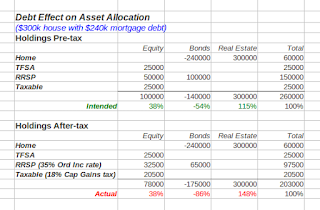
  • Home valued at $300,000 and a mortgage of $240,000. This is the new maximum 80% loan-to-value ratio for refinancing instituted in July 2012, when the federal government issued more restrictive rules to cool Canada's housing market. 
  • Financial assets are $200,000 (pre-tax), half in equities, half in bonds across taxable, TFSA and RRSP accounts, as in last week's post.

In our example, the home dominates the investor's total asset allocation. The investor's wealth is very concentrated in that one asset. There is a significant amount of leverage, as indicated by the large negative (-86% after-tax) in the bonds column.

Leverage entails risk and no one wants to lose their home. A critical question therefore is whether the mortgage payments can be maintained. Different people can have markedly different risk depending on their job security.

Invest in mortgage or RRSP?
Thinking of a home within the investment asset allocation raises the oft-asked question of whether to put extra cash towards paying down the mortgage or contributing to an RRSP or TFSA. The simple answer, as TaxTips.ca shows here, is to pick the one that has the highest return (TFSA or RRSP) or interest rate (mortgage). York University professor Moshe Milevsky elaborates on the logic in this article from the International Finance and Insurance Decisions Center.

Home is not an investment asset exactly like stocks and bonds
Milevsky (here in the Globe and Mail and in several videos on his website) and others such as financial advisor and author Larry Swedroe (here on CBS News) say a home is as much consumption as investment due to all the maintenance costs and property taxes and the modest long term returns (see blogger Preet Banerjee's post with stats up to 2008 and Milevsky's Houset Allocation with stats up to 2004). A house also differs in that it is one big indivisible lumpy holding. As a result the usual investment allocation fix of re-balancing cannot work. Later in life, when the mortgage has been paid off and other savings have built up, the mix of assets will not look nearly so lop-sided - e.g. this example where there is no mortgage and pre-tax financial assets have doubled.
One aspect of houses generally benefits the investor - house prices over the long term have a low correlation with the stock market (Milevsky's Houset article contains a table of correlations of real estate in various Canadian localities with the Canadian TSX and the US S&P 500), which means that prices follow a different pattern of ups and downs and when the stock market tanks, house prices don't usually follow suit. Total wealth gains greater stability. 

Over the short term, there might well be high correlation and simultaneous drops, as was the case from 2008 to nowadays in the USA when housing collapsed along with the stock market. Individual circumstances can also change the real estate correlation, for example owning a house in a one industry town and owning lots of shares of that company. A perfect storm could ensue - the company runs into trouble, its stock plummets, it shuts the local plant location, you lose your job and local real estate flounders.

Other kinds of debt
The same approach can be used to assess non-mortgage debt, whether it is used for investing, as we examined last year in Borrowing to Invest: When & How to Do It or simply to pay for consumption spending. The debt appears as a negative amount and if the debt buys returns-producing assets, that value shows as well.


A primary objective of asset allocation is to be aware of and to manage risk. We hope readers agree that taking the home mortgage and value into account is an important step in that process.

Disclaimer: this post is my opinion only and should not be construed as investment advice. Readers should be aware that the above comparisons are not an investment recommendation. They rest on other sources, whose accuracy is not guaranteed and the article may not interpret such results correctly. Do your homework before making any decisions and consider consulting a professional advisor.

Friday, 30 November 2012

Tax-Adjusted Asset Allocation

Spreading investment assets across different types of assets in order to diversify and reduce risk is a fundamental investing best-practice, which we wrote about in asset allocation and again in the context of an investment policy statement.

Two factors - taxes and debts, such as a loan or mortgage - can dramatically alter your asset allocation. Beware, what you see may not actually be what you have! This week, we'll explore the effect of tax.

Now that the cumulative TFSA contribution limits are reaching substantial amounts (4 years already at $5000 per year plus a just-announced higher amount of $5500 for 2013, making $25,500 in total), it is likely many investors will have investments spread through TFSAs, RRSPs and perhaps non-registered taxable accounts as well.

Taxation differs amongst account types! 

TFSA - The entire value within such an account is tax-free. Neither the principal / initial value / contributions nor any accumulated returns of whatever type, such as capital gains, interest and dividends is taxable. There is no tax along the way, year by year or upon withdrawal. TFSAs are wonderfully simple - what you see in your account is what you have to spend at any time.

RRSP (or other registered retirement accounts like LIRA, LRIF) - The entire value of these accounts is taxable upon withdrawal. Think of this as the fact that the government is your partner and owns part of your RRSP (read Retail Investor.org's Nitty-Gritty of the RRSP Model for a cleverly presented and detailed explanation). The percentage the government owns is the percentage of your marginal tax rate at withdrawal, which varies by province and income level (rates available from Ernst & Young's tax calculator). Everything is taxed at the rate for ordinary income, which is the highest marginal rate. It doesn't matter what type of gains were made (capital gains, interest, dividends), withdrawals are taxed as ordinary income. Taxes are only applied upon withdrawal, not year by year along the way. This makes our estimation a bit uncertain since it is hard to know what your exact tax rate may be in twenty years during retirement given all the possible future changes from government or your own circumstances.

The point remains, however, that a big chunk of an RRSP balance is not yours to spend, nor do the asset balances or allocations within represent what you have in reality after taxes. For instance, Ernst & Young's tax tables tell us that a Manitoba taxpayer with $80,000 taxable income will pay about 39% of an RRSP balance to the government and thus only owns 61%.

This could be very significant if you have followed the oft-cited advice to put all fixed income assets into the RRSP only, as we show in our example below. Your net real after-tax asset allocation could be quite different from what you intend.

Taxable - Interest, dividends and distributed capital gains (such as from ETFs or mutual funds that will show up on T-slips issued by providers or brokers) get taxed all along the way year by year. That part is simple and straightforward - there is no looming tax liability and no adjustment required to see net ownership or asset allocation. However, another part is not so simple. Capital gains that have accumulated through price increases of any security over its Adjusted Cost Base (see previous post on ETFs and Mutual Funds: Calculating Capital Gains) are not taxable year by year. Buy and hold investors who keep the same investment without selling for years may well have a substantial capital gains tax liability. That tax liability does reduce net amounts so an asset allocation adjustment is required.

Example
Let's use a Saskatchewan taxpayer at the $80,000 taxable income bracket. The tax rate on ordinary income is 35% and on capital gains is 18%. Furthermore, the portfolio is spread across a TFSA, a RRSP and a Taxable account. All of the fixed income bonds are in the RRSP. We'll assume the investor has made, but not yet cashed in, a $5000 capital gain in equities held in the Taxable account.

The investor wants to have a balanced portfolio 50% in each of equities and bonds. But that's not the reality after tax. Equities actually make up 56% of the portfolio.

The fix is simple enough. Rebalance to reflect taxes - boosting the bond holdings in the RRSP by selling some of the equities will shift the portfolio to the intended allocation.

The other, probably sobering, implication to the tax adjustment is that the investor has considerably less - $53,400 or 27% less - money to spend in reality than the account balances would seemingly indicate. As ever, it's better to face this unpleasant reality than ignore it.

One thing this tax adjustment does not suggest is that TFSAs or Taxable accounts are better than RRSPs, despite the zero or much smaller adjustment. TFSAs and RRSPs in principle give the exact same tax advantage. We note this and discuss other account comparison and choice factors in one of our most popular posts - RRSP vs TFSA vs RESP vs Non-Registered Taxable Account?

Next week, we'll explore the effect of debt on asset allocation.

Acknowledgement:  This post idea originated in Bill Reichenstein's Tax-Efficient Saving and Investing from the TIAA-CREF Institute website.

Friday, 23 November 2012

How to Sharpe-n Your ETF Selection Process

Reward vs risk, that is a universal, pervasive, constant and critical trade-off and comparison that we must make as investors. There is plenty of descriptive qualitative assessment of reward-risk factors and indeed that is useful but how can we get a quantitative assessment and put a number on it?

Enter William Sharpe, Nobel prize-winner for his work advancing investment theory, with the formula he created in 1966 called by others, not himself, the Sharpe ratio. Sharpe himself gave it a more explanatory name, the "reward-to-variability" ratio. The "rewards" part refers to returns, or performance, composed of price changes and dividends. The "variability" part refers to the familiar ups and downs of price, the volatility, which is the finance industry standard used to characterize the riskiness of securities like stocks and bonds and by extension to ETFs.

Things are not quite so simple and uniform in application!
Unfortunately, the excellent basic idea was found to be too worthwhile to leave alone in its original form. The academics, along with Sharpe himself, got busy expanding and perfecting it, as related in the Wikipedia Sharpe Ratio article, which contains a link to Sharpe's own expansion and generalization of the concept.

Depending on the formulation used, the Sharpe ratio may be calculated quite differently according to choice of benchmark, and may sometimes show a reward-risk variant called the Information Ratio (for those interested, a couple of good explanations of the difference are Clarifying the Information Ratio and Sharpe Ratio on Seeking Alpha and Adding Value in Fund Evaluations on Advisor Perspectives). Thus, we should not be too surprised that the actual values, often for the same time period, differ from source to source as we see below in our sample of some ETFs. None of the sources give enough detail on how the figures are calculated to know exactly what is going on so we have to take them as they are and use them as we can.

Delving into the details and the math can get very subtle. Let's simplify for us mere mortals. The bottom line - when comparing ETFs, higher Sharpe ratios are better. In other words, when returns in the numerator are divided by the risk/volatility in the denominator, the greater the ratio, the better. Higher returns with same risk gives a higher Sharpe Ratio, as does the same return with lower volatility. That makes intuitive sense.

Sources for Sharpe Ratios
Here are some websites that publish Sharpe Ratios for ETFs. The usual place for the Ratio is under the Risk tab.
  • Yahoo Finance - covers both US and Canadian ETFs but only has data for latest 3-year and 5-year periods (if the ETF has existed that long) i.e. no 1-year figures
  • Zecco - only US ETFs; time period not specified but looks like 3-years
  • IndexUniverse - only US ETFs; only for 3-years
  • BMO Investorline - US and Canadian ETFs for 1-year and 3-years; access under the ETF Compare tool; must be a BMOIL client to access;
  • TD Waterhouse - US and Canadian ETFs for 1-year, 3-years, 5-years, 10-years; access under the ETFs Fund Comparison tool; must be a TDW client to access;
  • Other online brokers possibly have this capability too - check under ETFs 
Example table
We looked up a sample of commodity and Canadian equity ETFs to come up with the following comparison table.


Ins and Outs of using the Sharpe Ratios
  • Look for patterns of higher results across sources and time periods e.g. in green highlighting iShares S&P/TSX Canadian Dividend Aristocrats Index Fund Common Class (TSX: CDZ) does best by quite a lot in both 1- and 3-year periods. However, as a dividend fund is it truly in the same category as the others in the list which are either cap-weighted (symbols XIU and ZCN), fundamentally-weighted (CRQ) or low volatility (ZLB)? We tend to think so but others may not. Note also how the barely year-old ZLB has an even better Sharpe Ratio than CDZ over the 1-year period. Will that continue? The 1-year blue highlighted Ratio in the table suggests that might be the case though it is early days. For an interpretation on how these types of ETFs might perform, see Tomatoes and the Low Vol Effect at Research Affiliates. It's interesting that much of the difference in Sharpe Ratio amongst these funds arises because of lower volatility (standard deviation) in CDZ versus XIU and CRQ and even lower volatility in ZLB (see our previous post on Low Volatility ETFs for a discussion of their promise). 
  • Sometimes the data may be wrong - we cannot be sure but the vast difference of Ratios for BLND and BCM in Zecco from others in the category looks too dissimilar to be true (yellow background cells). Neither ETF is three years old yet but the rest of the data looks like 3-year figures. Maybe Zecco has mixed time periods?
  • Sharpe Ratio is not the be-all and end-all - Other factors enter the picture in comparing and picking the best ETFs, as we have always done with our postings e.g. the latest on Commodity ETFs. Asset allocation and correlation, fit within portfolio goals, along with other risk factors (inflation and currency, default, management cost and taxes, required rate of return) all should play a role in ETF selection.
  • The future may not be like the past - Using data that goes back only three years or even five is not a long history that proves superiority conclusively. 
Bottom line: The Sharpe Ratio is another useful tool in the investor's arsenal. 

Disclaimer: this post is my opinion only and should not be construed as investment advice. Readers should be aware that the above comparisons are not an investment recommendation. They rest on other sources, whose accuracy is not guaranteed and the article may not interpret such results correctly. Do your homework before making any decisions and consider consulting a professional advisor.
Friday, 16 November 2012

Best Pick Commodity ETFs/ETNs for the Canadian Long Term Investor

Our original post in 2009 on investing in commodities outlined the diversification and inflation protection arguments as well as the risks. Our next post on the subject in 2010 looked at the then existing ETFs and ETNs to pick out a favorite. It's time to have a look again as several other new funds have come on the scene and the performance track record is accumulating.

The Commodity ETFs and ETNs
The panoply of commodity exchange-traded products available in US markets, which are of course purchasable by the Canadian online investor through a discount broker, is found on both ETFdb and IndexUniverse. We restrict our search to broad funds that track a basket with multiple commodities. There are also many single commodity funds available that are better suited to short-term speculation on the price of oil or gold, for example but we are looking at the investment to go within a diversified portfolio with wide asset classes. The only Canadian offering for a broad product that includes multiple commodities is the iShares Broad Commodity Index Fund (CAD-Hedged) (TSX: CBR).

Here is how we narrowed down the sixteen or so funds from ETFdb's list to the four, along with CBR, that look to be reasonable picks.

1) Futures contract rolling method - We eliminated any funds that use the so-called front month rolling method, which replaces an expiring contract with the nearest-dated contract. As explained in the Ten Commandments of Commodity Investing on Commodity HQ, not using front month rolling is extremely important to minimize the negative return effects of contango. The fund provider iPath emphasizes this primary selection factor in its factsheet iPath Commodity ETNs, in which it suggests that a front month rolling fund such as iPath® Dow Jones-UBS Commodity Index Total ReturnService Mark ETN (NYSE: DJP) is more appropriate to short-term trading. Note that DJP is the second largest fund by assets in the ETFdb list, illustrating that large and popular does not necessarily mean it is appropriate for a specific investing purpose and in our case it is not, so we have excluded it.

Beyond avoiding front-month rolling, it is more or less impossible to tell whose fancy rolling method will turn out to be best. UCI may, however, have slight edge since it buys futures up to three years out, which conforms to the ideas we uncovered in our 2010 post about the advantages of rolling contracts further ahead and less frequently. The usual caution applies - the future may not be like the past that created the data out of which the rolling method was conceived.

2) Index sector balance - We eliminated any funds  where one sector, energy being the problematic one, makes up more than 50% of the weight of the fund. Otherwise the fund's performance is dominated by that one sector. A prime purpose of owning a commodity fund is the diversification effect from the price evolution of various commodities. Our selections all exhibit a balance across multiple commodities. Again, that caused some high profile funds, including the largest of all, the PowerShares DB Commodity Index Tracking Fund (NYSE: DBC), to drop from our list.

3) Management Expense Ratio - Costs always matter, so the lower the MER the better. One of our picks, the UBS Bloomberg Constant Maturity Commodity Index Total Return ETN (NYSE: UCI), has the tied lowest MER of any commodity fund at 0.65%. MER is a big part of the reason our 2010 pick GreenHaven Continuous Commodity Index Fund ETF (NYSE: GCC) has dropped out of the preferred picks list. GGC's MER is 1.09%.

4) Credit Backing - Many of the newer funds are Exchange Traded Notes (ETNs) which rely on the credit-worthiness of the backing institution for capital protection (as opposed to the ETFs which rely on on the value of the portfolio holdings). All of the issuers are investment grade but UBS AG, backers of UCI and UBS DJ-UBS Commodity Index 2-4-6 Blended Futures ETN (NYSE: BLND), is getting towards the lower end of the scale with a Standard and Poors rating of only A. That is in contrast to the rock solid ELEMENTS Rogers International Commodity Index ETN (NYSE: RJI) whose Swedish Export Corporation backer's AA+ rating is higher than that of many governments!

Picks of the litter
Our preferred choices are as follows. Their key characteristics are shown in the detailed comparison table below.


Taxes for Canadian Investors
Taxes are not a differentiator for Canadians. Though US investors may be liable to pay annual income taxes to the IRS for ETFs, but not ETNs, it does not appear to be the case for non-US shareholders (note however, that this blogger is not a US tax accountant so it may be helpful to consult a tax professional). Since none of the funds, ETFs or ETNs, makes or intends to make any annual cash distributions, the only tax liability for a Canadian investor, and this would only apply within a non-registered account (i.e. not RRSPs, TFSAs, RESPs etc), would be capital gains to the Canada Revenue Agency upon sale of the fund.

All these ETFs and ETNs are considered to be US property and subject to US Estate tax provisions, which can apply to Canadians with US investments. See this TaxTips article on the subject but consult a professional to be certain if it applies to you.

Currency Hedging
Is CBR's hedging of the the US dollar worth it? We believe it is likely unnecessary and may detract from diversification but readers may wish to review pros and cons in our previous post on whether or not to hedge currency exposure and some historical results of hedging.

Performance, Correlation and Diversification Experience
How have the commodity funds fared? Have they delivered returns un-correlated  (and thus the diversification benefit) with mainstream equities like the US S&P 500 Index or the Canadian TSX Composite?

As our table shows for BCM, the recent correlation with the S&P 500 is much higher at 0.68 than the 0.3 (see Our Pick for a Broad Commodity Index Exchange-Traded Product) or less found in longer term calculations back to 1990. Several other commodity ETFs have correlations for the most recent 2-5 years in the 0.6 to 0.7 range. Such higher numbers are much less beneficial for diversification. If we eyeball the price movements of some of our funds against the TSX and the US' Dow Jones Index, we get the same impression, that they have been moving roughly in sync, though the commodity funds have more exaggerated ups and downs. The Beta numbers around 1.2 in the comparison table confirm the greater volatility (beta is a measure of stock price volatility relative to the overall market, with 1.0 the same as the market average and above 1.0 more volatile, below 1.0 less volatile).

1) vs TSX Composite (from TMX Money)


2) vs US Dow Jones Index (from Yahoo Finance)


The key question, to which no one really has an answer, will it last or will correlation go back down? Also, will prices of commodities continue their trend of upward price movement begun around the year 2000? The chart below from the latest BMO Capital Markets The Goods newsletter on commodities shows a considerable real return since 200 but flat for a couple of decades through the 1980s and 90s.

The basic decision of whether to invest in commodities may still be open to some question but we feel our above choices of funds will better suit the long term investor.
 
Disclaimer: this post is my opinion only and should not be construed as investment advice. Readers should be aware that the above comparisons are not an investment recommendation. They rest on other sources, whose accuracy is not guaranteed and the article may not interpret such results correctly. Do your homework before making any decisions and consider consulting a professional advisor.

Friday, 9 November 2012

Green Certification of Real Estate - Why investors should care

Investors with a particular interest in environmental sustainability, or those who just want to maximize their chances of picking money-making real estate REITs or stocks, should pay attention to green certification of buildings within the property portfolios.

Why does greenness matter to the investor?
The recent research paper Portfolio greenness and the financial performance of REITs by Piet Eichholtz, Nils Kok, Erkan Yonder on the website of the European Centre for Corporate Engagement found that in the USA greener REITs had higher Return on Equity, higher Return on Assets and higher Ratio of funds from operations to total revenue. The greener REITs's stock also had lower market beta, or volatility. The only somewhat disappointing result was that the green REITs did not exhibit excess or abnormally higher stock returns, a finding that the authors suggest is due to the fact that the stock prices have already incorporated and reflect the green advantage.

That there is a green advantage makes sense. Green buildings require proportionately less energy, lowering the impact of energy price shocks and stabilizing returns from properties. Energy is a big cost component. Buildings in the USA consume 74% of electricity and commercial property (which make up the holdings of real estate companies) makes up half of that. Greenness isn't just energy saving - greenhouse gas emissions, waste reduction and water consumption matter too.

Greener buildings have a longer economic life. Tenants prefer them and green buildings command higher rents (3% more per Eichholtz) and resale prices (+13%). There is less risk from the impact of future government regulation (is environmental regulation likely to get less or more we ask?). Green building certifications like the worldwide LEED (Canadian buildings listed here at Canada Green Building Council website), the US Energy Star, the Canadian BOMA BESt and various others in different countries, have rapidly gained acceptance.

The savviest investors, in the form of institutions like pension funds, are already paying close attention (as our previous post on Socially Responsible Investing noted). Some of the most convinced have extensive Canadian properties. The giant Canadian pension fund OMERS owns Oxford Properties Group, which assigns high priority to pursuing, reporting on and achieving sustainability in its business. Bentall Kennedy, owned in part by the BC Investment Management Corporation and CalPERS, is a world leader according to the Global Real Estate Sustainability Benchmark (GRESB) - see the 2012 GRESB report. Bentall Kennedy's view in its 2012 Corporate Responsibility Report on the Global Reporting Initiative database is that "corporate responsibility is simply better business" and will eventually produce superior returns. Ivanhoé Cambridge, owned by Quebec's huge Caisse de dépôt, is another real estate heavyweight with extensive Canadian properties that is fully committed to sustainability and greener buildings. The same goes for Cadillac Fairview, owned by the Ontario Teachers Pension Plan.

The following chart from the Oxford 2012 Sustainability Report neatly summarizes how greenness can benefit the real estate company, along with its tenants.


How do the publicly-traded Canadian REITS and real estate corporations stack up?
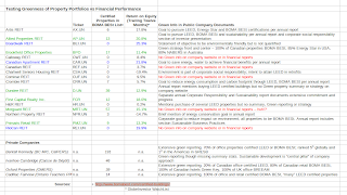
Since the individual online investor cannot of course buy shares in Bentall Kennedy or other privately-owned entities, we looked at TSX-listed real estate shares, mostly REITs, along with a few corporations. Our comparison table shows what we found. Ideally, we would have wanted to get summaries by company of the green-certified proportion of their property portfolios and then to compare their financial performance to see to what degree green does best in Canada.


1) The data looks spotty and incomplete and the degree of green commitment is often hard to determine - Only one company, Brookfield Office Properties, publishes how much of its portfolio is green and it is impressively high considering that Eichholtz estimated that only 1% of US REIT properties were LEED-certified in 2010 and only 6% Energy Star-certified.

But there are a number of strange things we found. The BOMA BESt database lists no less than 57 green properties under Morguard yet the company's website and annual reports say nary a word on green, sustainability, BOMA, environment, corporate responsibility or other such catchphrases. It seems odd to be just doing it and not talking about it. Even harder to fathom is that the biggest Canadian REIT by far, RioCan, says nothing about green on its website or in its reports and there are exactly zero of its buildings in BOMA BESt. In a telephone call, a BOMA representative could say that there are a few RioCan properties in the process of certification. A call to RioCan unfortunately did not elicit a response. It is hard to believe that RioCan is paying little or no attention to greenness.

The other popular green certification is LEED and a list of certified buildings is on the Canadian Green Building Council website here. Unfortunately, the 2600 buildings, which includes single family homes, does not identify property owners, only addresses. Linking the addresses back to the companies would be a very laborious task.

2) Several companies appear to have a very strong commitment to greenness - That is shown by strong statements and specific sustainability/responsibility reports: Allied Properties REIT (AP.UN), Brookfield Office Properties (BPO), First Capital Realty Inc (FCR) and Primaris Retail REIT (PMZ.UN). It's not only words, they have more BOMA BESt buildings too. Dundee REIT (D.UN) seems, like the puzzler Morguard, to be another company of action not words with its high number of BOMA BESt buildings.

3) Green companies generally achieve reasonable return on equity (ROE) - The green-highlighted companies with the most BOMA BESt listings all sport a healthy ROE.

4) Green certification is not the only route to success - Three companies (highlighted in blue) with not a single BOMA BESt listed property - RioCan, Canadian Apartment REIT (CAR.UN) and Boardwalk REIT (BEI.UN) - have excellent ROE. Thus, a focus on greenness is not the only way to achieve high returns. Maybe these companies are doing the green cost saving measures, or others not specifically green, and not bothering with certification.

Nevertheless, green certification of buildings in real estate portfolios is a useful indicator of investing value for the investor. 

Disclaimer: this post is my opinion only and should not be construed as investment advice. Readers should be aware that the above comparisons are not an investment recommendation. They rest on other sources, whose accuracy is not guaranteed and the article may not interpret such results correctly. Do your homework before making any decisions and consider consulting a professional advisor.

Friday, 2 November 2012

Socially Responsible Stocks – Which ones are the solid money makers?

Last week we looked at the performance of ETFs holding a basket of stocks that meet the criteria of being Socially Responsible (SRI). The track record and the academic research suggest SRI stocks in combination on average get about the same returns as a benchmark cap-weight index. That's enough to satisfy one's conscience perhaps, but suppose we seek better returns. Can we avoid the duds and pick only the best stocks?

Defining what "Best" means ...
This week we drill down into the Canadian SRI stocks to see which ones look to be the best, in terms of:
a) consistent company performance plus
b) solid stock returns 
c) the most attractive value at the moment
d) considering also the desirability of low volatility and healthy growing dividends.

Narrowing Down the Canadian SRI Stock Universe
We start with all 71 Canadian stocks that pass screening for SRI criteria in two ETFs - iShares Jantzi Social Index fund (TSX:XEN) and Pax MSCI North America ESG Index ETF (NYSE: NASI). To get a table with lots of useful data, we plugged all 71 stock symbols into the Globe WatchList and then used its handy export feature to download the data into a spreadsheet on our PC for further sorting and entering additional data.

Step 1 - Consistent profitability - First hurdle for the stocks to pass - how many years out of the last five has the company made positive earnings. Our minimum is at least 4 out of 5 and no loss in the most recent financial year or trailing twelve months. Right away, we drop several companies with a negative return on equity (ROE) in the past year i.e. ROE can only be negative if the return/earnings are negative. Unfortunately, the WatchList table doesn't include ROE for the past five years so we had to look elsewhere. To do this, ADVFN's company information under the Financials tab (e.g. for Bank of Nova Scotia) has a nice graph of five-year ROE. For a handful of the stocks in our table, ADVFN doesn't have any data so we turned to TMX Money and the Financials/Income page for the stock to see the net income for the past five years (e.g. here for Pacific Rubiales Energy). Goodbye to a bunch more stocks (like Westport Innovations which hasn't made any profits in the last five years).

Step 2 - Dividends growing - Any company that cut its dividend, or failed to increase it at all during the past five years, we also deleted. We left one company in our list that had no increase - CGI Group - since it has a policy of not paying a dividend but it has been increasing earnings per share at a very healthy and steady pace over the five years. In several cases we had to clarify and correct data in the WatchList download by referring to TMX Money or to iTSX.ca, which gives easy quick access to dividend data.

Step 3 - Healthy fundamentals - Companies that had very low return on equity (under 10%), poor operating margin or high debt to equity ratio, also got deleted.

Step 4 - Reasonable stock returns - Companies with much poorer returns than two benchmarks - the XEN fund itself, or the iShares S&P/TSX 60 Index (TSX: XIU) - were removed. However, we did not set a strict cut-off since negative market sentiment that has caused stock price declines might well be reversed, especially when company fundamentals are sound. This dovetails into the last step, judging reasonable stock value.

Step 5 - Attractive stock valuation - The starting point measure of an attractive stock price is the price to earnings ratio (P/E), the lower P/E the better, other things being equal. We therefore eliminated stocks with P/E over the XIU benchmark figure of 18.3. It is thanks to BMO Investorline's (client access only) ETF Compare tool that we were able to obtain the P/E and price-to-book figures for XIU and XEN.

Beta, a measure of volatility, was also taken into account, with values under XIU's 1.0 being a plus. We allowed Potash Corp to stay in despite its very high beta of 7.4 due to compensating factors like very high ROE, operating margin and dividend growth rate with a quite low P/E.

Finally, we note the investment firm analyst ratings (keeping in mind the caveats of such), the majority being "Hold", and any insider buying or selling activity (recent data from TMX here; see also our post on why this can matter here)

The Solid SRI Stocks
We do not pretend that every one of the 27 stocks in the results table below will be a winner. Past performance is only a guide, not a guarantee. But we believe most will do well. Nor do we think there are many blockbuster winners. Our method has directed us to the steady solid performers. That would perhaps be enough to satisfy most investors, both in their pocketbook and in their conscience.


Disclaimer: this post is my opinion only and should not be construed as investment advice. Readers should be aware that the above comparisons are not an investment recommendation. They rest on other sources, whose accuracy is not guaranteed and the article may not interpret such results correctly. Do your homework before making any decisions and consider consulting a professional advisor.

Friday, 26 October 2012

Socially Responsible Investing: Trends and ETF Track Records

When we first explored back in 2009 the idea of vetting investments based on ethical criteria, the ETFs created to implement the idea were relatively new and there was no real track record to say whether investment returns were the same, better, or worse than the broad market index funds. Was the idea just a fad that would pass in the face of other concerns like jobs and the economy after the 2008 credit crisis and its aftermath?

There is a collection of terms describing facets of the concern many people have - corporate social responsibility, ethics, governance, sustainable development, green or environmental responsibility. If we are to judge by how often these ideas receive mention in the worldwide press as tracked by Trends in Sustainability's Online Analysis Tool, which was used to generate the charts below, the multi-decade upwards trend of Sustainability suggests an important impetus for investors to consider.

Sustainability idea rising in importance for decades
Key sustainability issues - climate change (environmental), human rights (social), corruption (governance)


No big move to ESG/SRI as an investment trend for individuals
The explosion of ETFs in just about every direction has not yet reached the ESG/SRI slant. There is still only one Canadian ETF - the iShares Jantzi Social Index® Fund (TSX: XEN) - which five years after its launch has gathered a puny $17 million in assets. In the USA, there is only a handful of such ETFs (see ETFdb's screener result for SRI) with about $360 million in total assets, a small amount for the US market.

Apparently, institutional investors have been much more active in pursuing SRI investing according to this European report.

A high degree of overlap between ESG/SRI ETF holdings and non-SRI counterparts
Perhaps it is encouraging to know that the Jantzi index developers Sustainanalytics judge that so many large Canadian companies meet their SRI criteria. The result is that three quarters of XEN's holdings are also in the standard dominant cap-weighted Canadian equity ETF, the iShares S&P/TSX 60 Index Fund (TSX: XIU). XEN's holdings that are not part of XIU amount to only 2.67% of the fund's total assets.

The overlap between the US-oriented funds
is even higher at 80 to 85% with the iShares Core S&P 500 tracker (NYSE: IVV). In fact, the stocks the stocks are mostly deliberately chosen from amongst those in the mainstream large-cap US market index. The overlap is by design.
Result: a close tracking of the market performance of the mainstream ETFs by the ESG/SRI ETFs
The high degree of overlap seems to be more powerful in determining returns than the influence of stocks in the mainstream index that the ESG/SRI ETFs leave out. Indeed the KLD FactSheet explicitly says the aim is for the ETF to show the same risk and return characteristics as its mainstream kin.

Canada
XEN bounces along in close alignment with XIU as seen in this screen capture from BMO Investorline's ETF Compare Tool (available only to BMOIL's clients). Moreover, the annualized total return over the past five years is very close: XEN at -0.99% vs XIU's -0.40%. That is just about the difference between the XEN Management Expense Ratio (MER) at 0.55% and XIU's at 0.18%. The small annual difference adds up in the long run. Over five years, XEN's cumulative total return is -3.89% vs XIU's -2.37%

USA
KLD and DSI follows IVV quite closely. Even NASI, despite about 10% of its holdings being Canadian stocks, follows the IVV's contours, though its more recent startup produces the higher starting point of its line in the chart below. Higher MERs on the ESG/SRI funds at 0.50% likely account for most of the slight annualized under-performance. That annual difference has added up. Over the past 5 years, KLD returned 1.33%, DSI 1.91% while IVV returned 4.07%.

EAFE / Developed Countries
The same close tracking shows up with the Pax MSCI EAFE ESG Index ETF (NYSE: EAPS). Over the year since its launch it has earned 6.08% while the standard cap-weight equivalent Vanguard's MSCI EAFE ETF (NYSE: VEA) returned 5.67%. It remains to be seen whether more years under the belt will see VEA pull ahead - its MER is only 0.12% vs EAPS' higher 0.55%.

Bottom Line
The above returns results jive with the bulk of academic research, such as summarized in the 2007 paper Does Socially Responsible Investing Hurt Investment Returns? (answer = no) from Phillips, Hager and North or Meir Statman and Denys Glushkov's 2009 The Wages of Social Responsibility on Miller/Howard Investment Inc's website (answer = the advantage of picking stocks with high SRI scores is more or less offset by the disadvantage of SRI's shunning "bad" companies).

Such academic studies did not factor in costs, such as the MER. The biggest issue is the higher MERs at 0.5+% of the ESG/SRI funds while the mainstream broad market large cap funds have MERs of 0.1% or less. That seems to be creating longer-term rising cumulative under-performance. If so, whether SRI/ESG ETFs are worth it is an individual investor decision.

Disclaimer: this post is my opinion only and should not be construed as investment advice. Readers should be aware that the above comparisons are not an investment recommendation. They rest on other sources, whose accuracy is not guaranteed and the article may not interpret such results correctly. Do your homework before making any decisions and consider consulting a professional advisor.

Friday, 19 October 2012

Pros and Cons of Managed Futures ETFs

What's not to like about an investment that delivers returns like the dark blue in the chart below taken from Frequently Asked Questions About Managed Futures at the CME Group website? Through thick and thin of the last 30 years, the dark blue line has gone ever upward with downward blips that are almost imperceptible compared to the 2001 Dotcom bubble crash and the 2088 Credit crisis.
The Barclay CTA Index line in the above chart represents an average of tracked results of Commodity Trading Advisors, professional investors who carry out Managed Futures strategies. Until recently such strategies have been the exclusive domain of large institutional investors such as pension funds and hedge funds.

In the past year or so, the expanding ETF industry has latched onto the idea to launch several Managed Futures ETFs, first in 2011 in the USA and then this year in Canada - the iShares Managed Futures Index Fund (TSX: CMF) and the Horizons Auspice Managed Futures Index ETF (TSX: HMF).

What are Managed Futures?
Managed Futures use futures contracts traded on exchanges such as the CME, NYNEX and others to build portfolios with exposure to a diverse range of:
  • agricultural commodities (e.g. grain, corn, soybeans, cotton), 
  • metals (e.g. gold, silver, copper), 
  • energy products (e.g. crude oil heating oil, gasoline and natural gas), 
  • currencies (e.g. the Canadian dollar, the US dollar, Japanese Yen, Euro) and
  • interest rates (e.g. US Treasury 5-Year or 10-Year or 30-Year bonds)
The key feature of Managed Futures is their active management strategies, which generally (though not always as CME points out) follow price trends in the market. When prices are going up, the strategies invest long and if prices are going down, they sell short. Thus, a Managed Futures ETF's holdings might be long crude oil futures one month and short the next. The overall portfolio will usually be a mix of long and short positions, as can be seen in our comparison table below of the two Canadian ETFs in the category. The aim is to make money whether markets are rising or falling, unlike traditional index ETFs that hold only long positions and make money when markets are good but lose in downward times.

Pros
  • Non-correlated with mainstream equity and bond returns - A portfolio with various non-correlated types of assets can attain lower volatility and better returns as the following marketing chart from Horizons shows for the back-testing done on its new ETF's index in combination with Canadian and US equity holdings. A different Managed Futures index, the popular Barclays BTOP 50, shows similar low or negative correlation with equities and bonds in data spanning 1987 to 2011 (cited in Lintner Revisited: A Quantitative Analysis of Managed Futures in an Institutional Portfolio)
 
  • Managed Futures have gone up especially when things are really bad in equities - Perhaps the most striking and attractive performance feature (see table below from the Lintner Revisited paper), at least in the past and through the index, is that the worst downward market quarters for equities were marked by upward moves in the Barclays BTOP 50! 
 Cons
  • Past performance is not necessarily indicative of future results - This frequently encountered warning, which we conveniently copied right from the same Lintner paper, tells us to look closely at possible limitations. The table shows that in several bad equity quarters, the BTOP 50 also lost ground, albeit less. Every crisis is different. Some types of conditions are bad for trend followers - rapid price reversals, or the sudden onset of high volatility. The rules of thumb for the intuitive traders or the complicated mathematical formulas that detect the trends, may stop working. Most of the CTAs, and certainly the new ETFs, have based their investing rules on algorithms derived from past price movements that may not work in the future.
  • Indices may be touting what worked and ignore what failed - Michael Zhuang of the Investment Fiduciary blog levels a couple of criticisms along those lines in Managed commodities can counter volatility…NOT, as does investment author William J. Bernstein in On Stuff.
  • An Index is not investable and the ETF may not be able to track the Index - There are two problems. First, the indices we have cited are averages of many CTA strategies so an ETF cannot replicate what those averages show. And as we see in our comparison of HMF and CMF, different versions of trend following can produce dramatically different results. The second issue is that ETFs have costs (MER, trading, accounting, bid-ask spread, tracking error) which can severely undermine returns the investor actually receives. At times when markets don't have strong trends, constantly reversing direction, there may be not much return to offset the costs, which don't stop.
  • Returns come in larger but infrequent lumps and may be years in waiting - The Lintner Revisited paper says an investor should expect strong returns only over periods of three years or more. Many may lose patience and bail out when seeing lack of gains over a couple of years.
The Canadian Managed Future ETFs
  • Holdings - As we noted above, the two Canadian-traded ETFs have quite different portfolios. Less than half the holdings are the same. The iShares offering CMF includes a number of US equity futures while HMF has none. For one holding, heating oil, CMF is short, judging that the price trend is down, while HMF is long, detecting an upward trend. This illustrates again that strategies do not converge and obviously returns of the two ETFs will be quite apart as well.
  • Results so far - It is thus not surprising to see this chart from Google Finance. CMF and HMF haven't moved at all alike and neither is much like the TSX equity index either. Contrary to the intention that they should make money in good times and bad, both so far have lost value.

  • Fund Costs - CMF and HMF are not cheap for ETFs, though they may be in comparison to managed futures hedge funds which typically charge 2% MER plus 20% of any returns over a target benchmark. Both CMF and HMF have a 0.95% base MER, on top of which the ETFs get charged a 0.45% fee to pay the counterparty which is involved in the actual implementation (a tricky swap structure described in the Investment Strategy section of each ETF's Prospectus, which is available through Sedar's search for investment page). CMF also has an approximate 0.15% fee to pay for the hedging of returns back to the Canadian dollar. Its total fees are thus 1.55%, to which get added other return-reducing costs of unknown magnitude like trading commissions, index-licensing, legal and and accounting. HMF has the currency hedging too but does not state a cost for the service.
Bottom Line
Are these a must-have for every investor? It's hard to say. The crisis countering performance is quite attractive and the world is surely not done with financial crises but the implementation results in actual products have not been proven.

Further Reading:

Disclaimer: this post is my opinion only and should not be construed as investment advice. Readers should be aware that the above comparisons are not an investment recommendation. They rest on other sources, whose accuracy is not guaranteed and the article may not interpret such results correctly. Do your homework before making any decisions and consider consulting a professional advisor.